Data visualization:
Climate Change
University project at UAL, London.
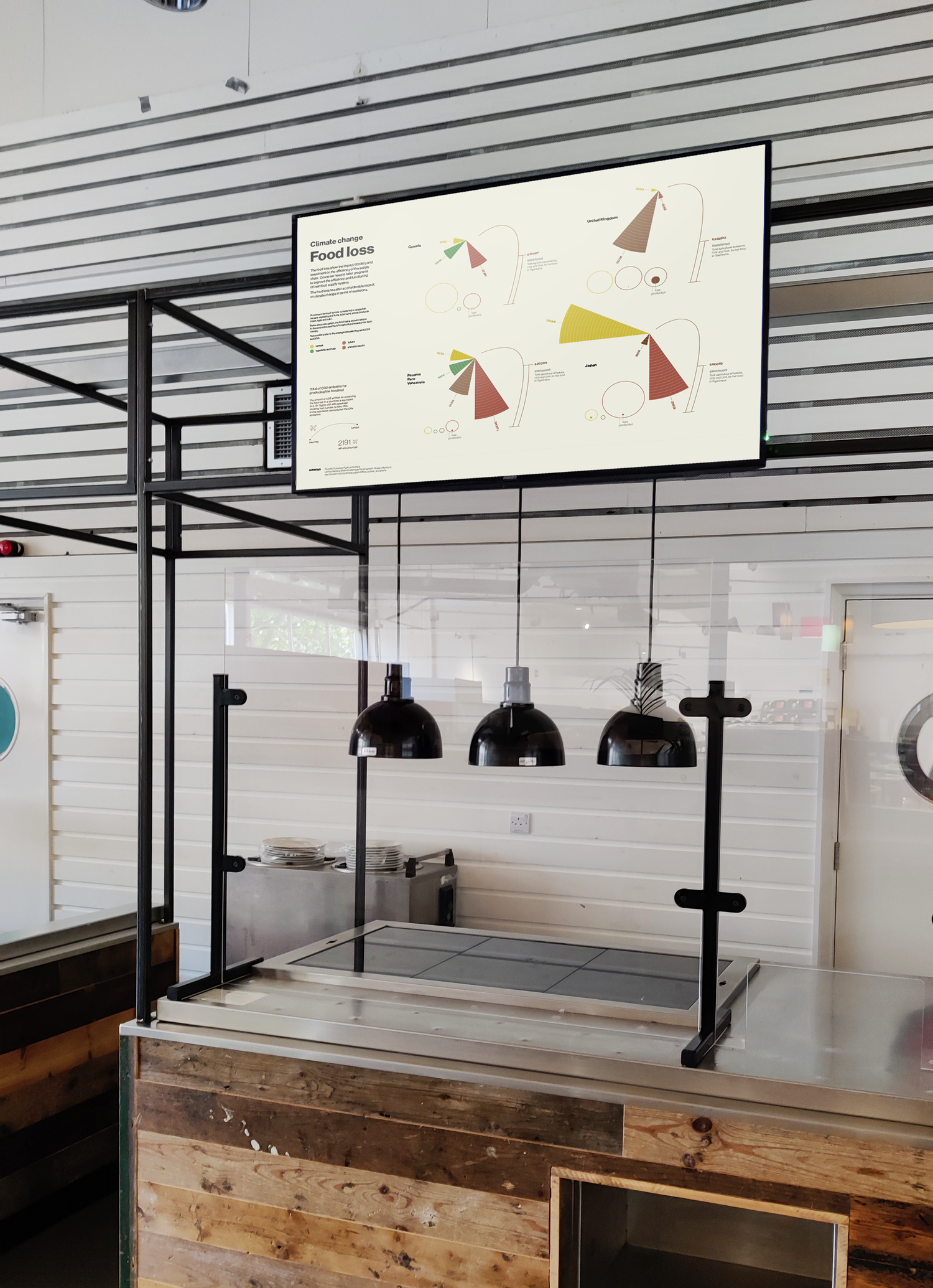
This data visualization project is meant to visualize the food loss in some countries and how this impacts in terms of gas emissions.

Skills and Tools
︎ Data refinement and elaboration, graphic design
︎ Adobe Illustrator, Excel
The process
The data source is mostly the FAO database. All data needed to be refined and consolidated. That let me understand the framing (time and country), the focus, and angle (showing the data about production for comparing them).
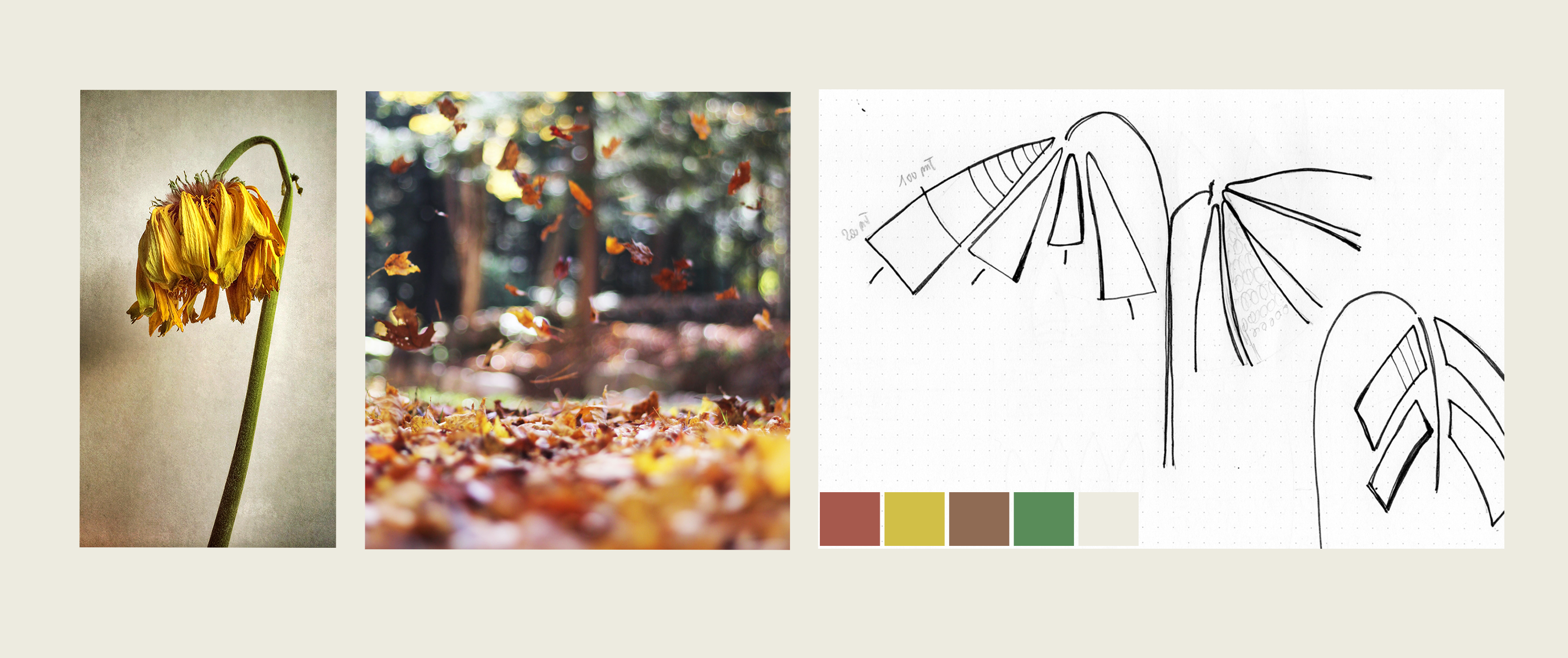
At this point, with the data in mind, I started to visualize them through some sketches to understand the better way to represent the main focus.
I’ve found inspiration in nature, specifically in dead flowers’ shapes and autumnn colors.